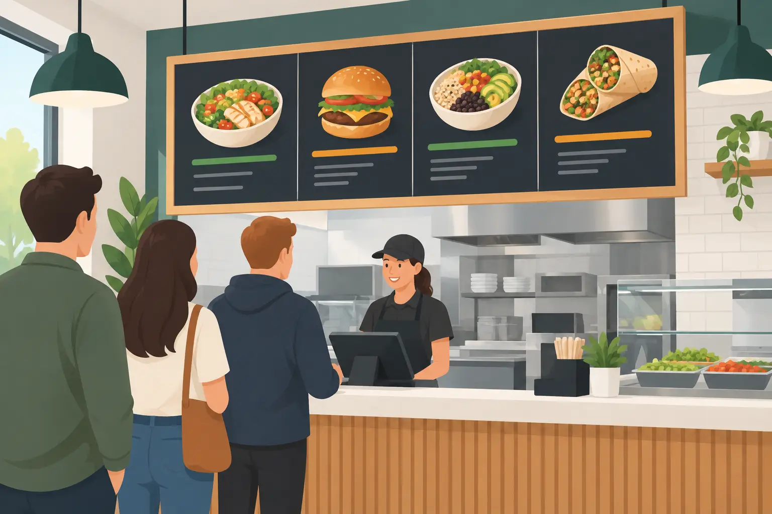
Restaurant Menu Board Signs That Speed Orders
Updated: 2 hours ago
A customer standing at the counter should not have to search for the price of a coffee, wonder which combo comes with fries, or hold up a lunch line while reading a crowded wall. Well-designed restaurant menu board signs answer those questions before the customer reaches the register. They keep orders moving, give your best-selling items the attention they deserve, and make your operation look organized from the first glance.
For restaurants, cafes, delis, bakeries, food trucks, and takeout counters, a menu board is not just decor. It is a working part of daily service. The right format depends on your space, your menu, and how often prices or specials change.
Start With the Way Customers Order
Before choosing materials, look at the customer’s path from the door to the point of sale. A quick-service restaurant may need a large wall menu that can be read from the back of the line. A bakery may need small, clean counter signs for pastries, flavors, and seasonal items. A food truck often needs durable outdoor menu signage that holds up to handling, weather, and repeated setup.
The key question is simple: what does a customer need to know before placing an order? Put those answers where they can be seen quickly. Categories, prices, add-ons, dietary notes, and featured combinations all have a place, but they should not compete for attention.
A menu with dozens of offerings may need several panels, organized by category. A focused coffee or lunch concept may be stronger with one large sign and a few supporting pieces near the register. More space is not always better. A board that is too large for the amount of information can make a simple menu feel sparse, while too much information in a small area becomes difficult to read.
Restaurant Menu Board Signs Need a Clear Hierarchy
People scan a menu before they read it. Your categories should be the easiest elements to spot, followed by item names, then prices and descriptions. If a guest cannot find “Sandwiches,” “Breakfast,” or “Cold Drinks” in a second or two, the layout needs more structure.
Use type sizes that match the viewing distance. A menu mounted high behind a counter needs larger lettering than a tabletop display. Fine script may look appealing on a screen, but it can be hard to read across a busy room. Clear fonts, high color contrast, and enough space between lines will do more for sales than overly decorative design.
Photos can work well when they show a signature item customers may not recognize. They can also create clutter when every item gets an image. For most local restaurants, one or two strong food images or a simple branded graphic is enough. The food should look like the food customers will receive. A clean photo of a real specialty item is more persuasive than a generic image that does not match your kitchen.
Descriptions need the same discipline. A short phrase can help customers understand an item and encourage an upgrade. A long paragraph slows the decision down. Save detailed ingredient explanations for printed takeout menus or staff conversations when the menu board is already carrying a lot of information.
Choose a Material That Fits the Job
The best menu board material depends on where it will be used and how often you expect to update it. Indoor wall menus are often produced as printed panels, mounted graphics, or individual signs that create a polished permanent display. Rigid materials can give a clean, professional finish and are especially useful for menus that stay consistent for months at a time.
Vinyl lettering and graphics are a practical choice for walls, windows, menu panels, and existing display surfaces. They work well when you want a crisp, custom look without building a large, heavy sign. For a restaurant with a simple menu and established branding, vinyl can create an efficient, easy-to-read presentation.
Chalkboard-style boards and dry-erase surfaces are useful for daily specials, soup selections, market prices, and limited-time offers. They are flexible, but they come with a trade-off: someone has to update them neatly and consistently. If handwriting varies from shift to shift, the board can quickly look less professional than the food and service you provide.
Digital menu displays make sense for businesses with frequent pricing changes, multiple dayparts, or rotating promotions. They are not automatically the right answer for every location. They require equipment, power, content updates, and a plan for what happens if a screen goes down during service. Many operators get the best results by combining a stable printed main menu with a smaller changeable sign for specials.
For outdoor ordering windows, patios, or food trucks, durability matters as much as design. Materials must stand up to sun, moisture, temperature changes, and cleaning. Make sure the menu remains readable in direct light and does not rely on colors that fade into the background outdoors.
Make Profitable Choices Easier to See
A menu board can help guide customers toward the items that support your business goals. That does not mean hiding prices or pushing every guest toward the most expensive option. It means giving popular, high-margin, or signature items a clear place in the layout.
Feature a combo, add-on, or house specialty where customers naturally look first. If a beverage, side, or dessert is an easy addition to an order, mention it at the point where the decision is being made. A small, well-placed message such as “Make It a Combo” often works better than a dense promotional block.
Price formatting also matters. Keep it consistent. When prices are scattered, aligned differently, or use several styles, customers spend more time comparing than ordering. If you offer size options, show them in a simple order. If modifiers have an extra charge, make that clear without making the board feel crowded.
Consider the pace of your busiest period. During a morning coffee rush or weekday lunch service, customers favor familiar choices and quick decisions. Highlighting a few ready-to-order selections can shorten lines and reduce the number of questions your team has to answer.
Plan for Updates Before You Print
Menus change. Suppliers adjust prices, seasonal items come and go, and a new bestseller may earn a permanent spot. Building your menu board with updates in mind can save money and avoid replacing an entire display over one small change.
Separate sections that are likely to change from the items that stay fixed. For example, your core sandwich or coffee menu may be printed as permanent panels, while a smaller panel handles seasonal drinks, daily desserts, or market-priced items. This approach keeps the main display sharp and makes updates more manageable.
Check every detail before production: spelling, pricing, item availability, allergens, phone numbers, and brand colors. Have someone unfamiliar with the current menu read the proof. They may spot an unclear category or missing price that your team has overlooked because they know the menu too well.
It is also smart to think beyond the main board. Matching window decals, counter signs, pickup-area labels, and promotional posters create a more consistent experience. A customer should know where to order, where to wait, and where to pick up without asking staff for directions.
Get the Installation Details Right
A strong design can still underperform if it is installed too high, blocked by equipment, or placed in poor lighting. Stand where customers stand and test the view. Can people read the board from the end of the line? Is the text visible above a pastry case or register display? Does overhead glare make certain sections disappear?
Mounting height, panel spacing, and lighting should be planned together. In a narrow space, a vertical arrangement may be easier to read than one long horizontal board. In a wide counter-service restaurant, multiple panels can help break the menu into natural sections. Leave enough room around the display so it feels intentional, not squeezed into an unused patch of wall.
For a custom project, experienced sign production can make the difference between a menu that looks good on a proof and one that works in the room. Timely Signs has helped businesses since 1968 turn their branding and day-to-day information into signs built for real customer traffic.
Your menu board should make the next choice easy: choose the meal, place the order, and come back again. Start with the customer’s view, keep the message clear, and build in room for the changes your restaurant will make along the way.


Comments